Most websites in 2016 are now looking to achieve a more minimalistic look. This trend actually isn’t limited to the web designing itself. It has its roots in the global market of fashion and interior design. Both fashion and interior design is going through its phase of brighter and happier tones. Now in terms of design, nothing can be distinguished from each other – the colors that are fashionable in the fashion industry or interior design shall be fashionable for web design also.
To put it in simpler words, what’s in fashion is what sells and appeals. Even after the advent of the instagram revolution, people have started become comfortable using trendier colour palettes on their photographs. People respond to colour according to the current tastes they hold – the tie they wear, the socks they buy, the gowns, the handbags, purses, etc. Hence it is important to understand at This point of time that we should expect a vibrant internet with a fresh new look and bright flashy colours.
What makes the trend inevitable?
1. Emergence of the almost flat design: The almost flat design keeps it minimal and only adds a depth to the icons(which was absent in the flat design) to make it more appealing. To compliment the otherwise simple look, a mix of bright colours will definitely help.
2. Clear background: Performance requires the background to be with no frills. It needs a simple plain background. This already cuts down a lot on the design possibilities with an interesting background. Hence to compensate for the loss of a heavy background image file, colours can play their role to help make the website more appealing.
3. Visual communication: Bright colours have drastically improved the ways of visual communication. They have put a full stop to the previous “template” look of the plug and play site themes.
4. High definition: The emergence of HD has been a major development and this has allowed bright colours to express themselves in the correct resolution. It has been possible to negate the amateur look that was once associated with flashy colours. Now using these same bright colours is considered to be professional. The more pixels per inch have helped in making the colours distinct and revealing innumerable shades of the same hue.
5. Increase in number of web safe colours: Thanks to HD technology, now it is possible to access more than a million web safe colours. In the recent past, we had been restricted to a meagre 216 web safe colors.
6. Using more colours effectively: One simple idea would be to keep the majority of the website in black and white and then use a flash of colours in the headings and the subheadings. This allows the colours to stand out from one another.
Colours have an essence in themselves – blue signifies serenity, red is happy, bright, dangerous, important. So colours can be more effectively used by associating their essence with the iconography on the website. Colours if used properly can become a great organizational tool.
7. Scrolling
Websites with easier scrolling options seems to do better too. Website scroling needs to be simple, and effective.
8. Responsive designs
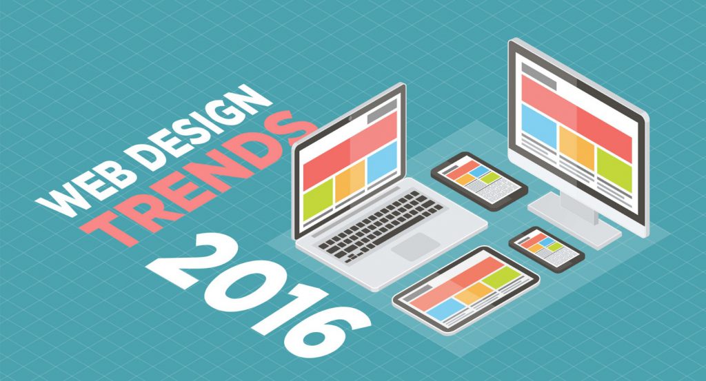
Websites that are responsive and work across different devices easily is what most business owners are looking up to, making it one of the hottest web design trends in 2016.
 (0)Dislikes
 (0)
(0)


